
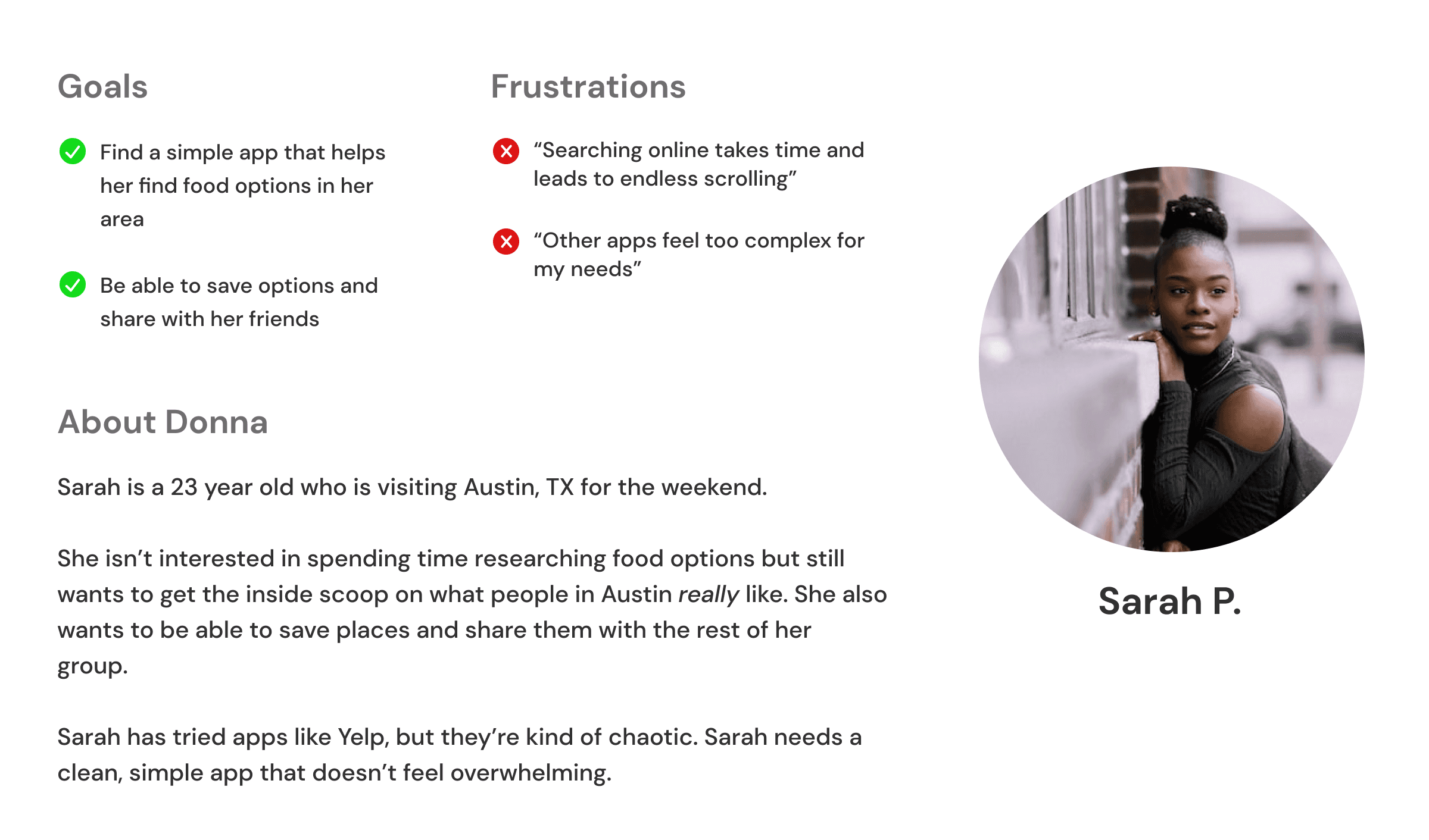
Foodie ATX
A local-first food discovery concept built for Austin — focused on saving for later, sharing lists, and cutting through review noise.
Role
Lead Product Designer
Scope
UX, UI, Research, Dev collaboration
Status
Concept → Discontinued
Austin’s food scene is booming, but discovery is noisy, reviews are inflated, and “saving for later" is a mess.
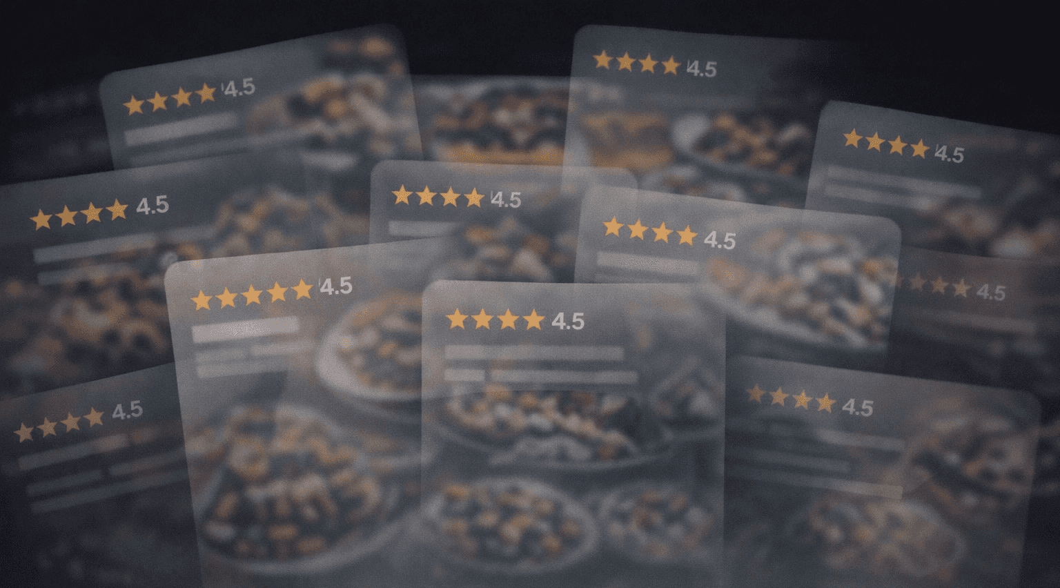
• Ratings don’t differentiate. Most places cluster around 4.3–4.7, so the signal is weak.
• Social saves aren’t structured. People save posts, not restaurants—lists get lost.
• Trust lives with locals. Word-of-mouth beats anonymous reviews.
• Design Goal
Build an Austin-only discovery experience where saving + sharing lists drives retention and organic growth.
02 - RESEARCH
Prove the pain, then earn the pivot.
Survey + interviews to validate review fatigue and test appetite for curated local discovery.
82%
Tried “high-rated” spots that disappointed
67%
Prefer word-of-mouth over reviews
74%
Want Austin-specific curation
45%
Get stuck choosing due to too many options
• Pivot
Discovery is infinite. Lists are personal. Favorites became the cornerstone because it turns taste into something you can keep, share, and grow.
“Everything is 4.5 stars—it’s hard to tell what’s actually good.” — Participant
“I’d rather get recommendations from locals who know the scene.” — Participant
“Saving restaurants should be as easy as saving a post.” — Participant
“I just want one place that remembers my spots.” — Participant
03 - FLOW
Make the core loop obvious.
Core task flow: discover → detail → directions → save → share. Everything else is support.

This flow clarified the moment of intent: people decide before they commit. The product optimizes for save → recall → share, not endless browsing or forced decisions.
04 - LO‑FI EXPLORATION
Explore wide. Then cut hard.
Core task flow: discover → detail → directions → save → share. Everything else is support.
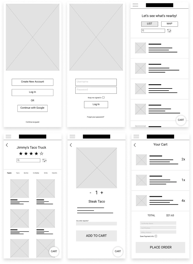
These wireframes tested whether users would save first as a lightweight commitment before choosing directions — reducing decision fatigue and premature decisions.
Feedback pushed the design toward fewer choices per screenand clearer list structure, helping users act quickly without comparing dozens of options.
Ordering was explored, then intentionally cut. Research and feasibility showed the strongest value was remembering and sharing spots — not transacting.
05 - HI‑FI
Restraint over polish.
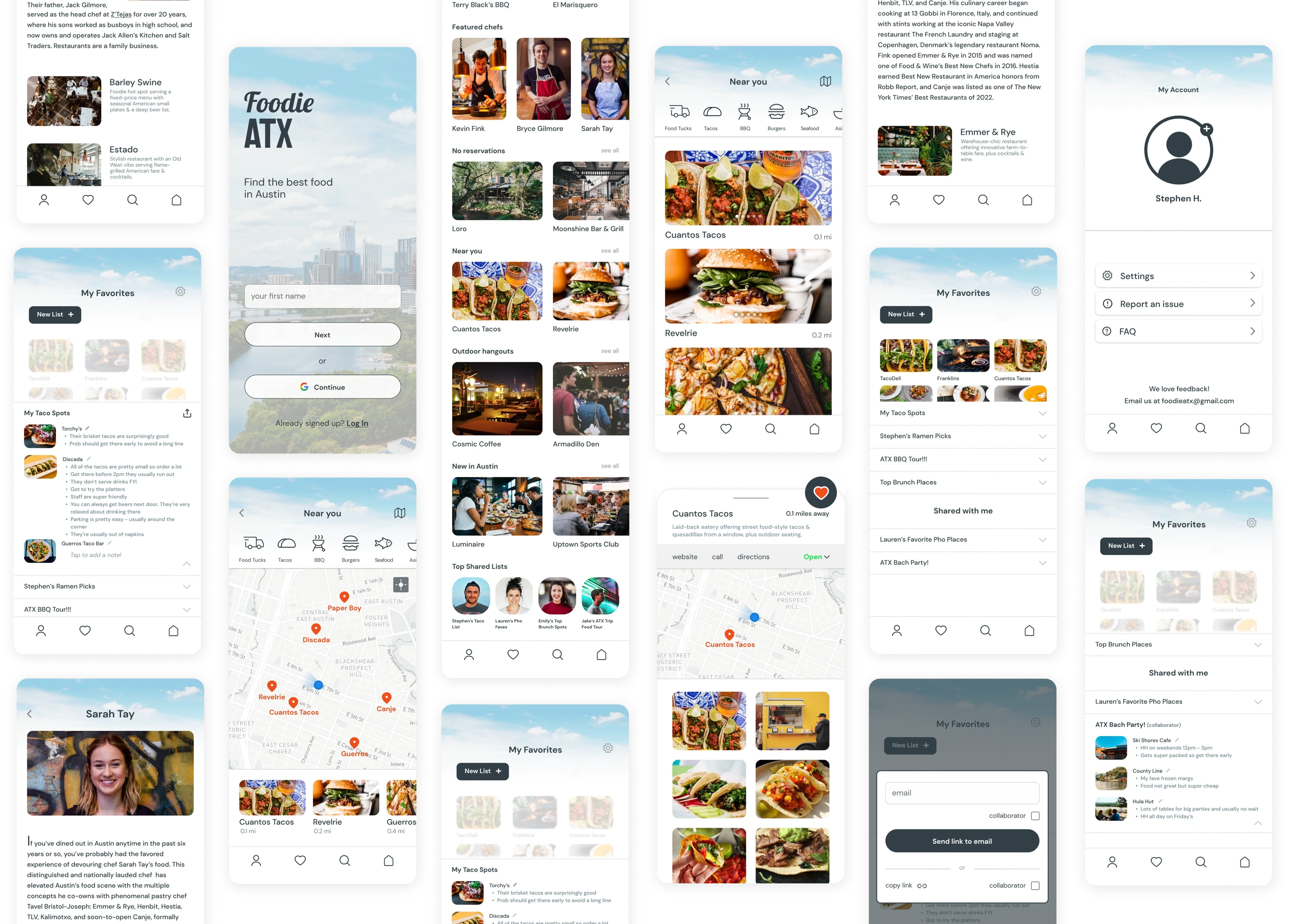
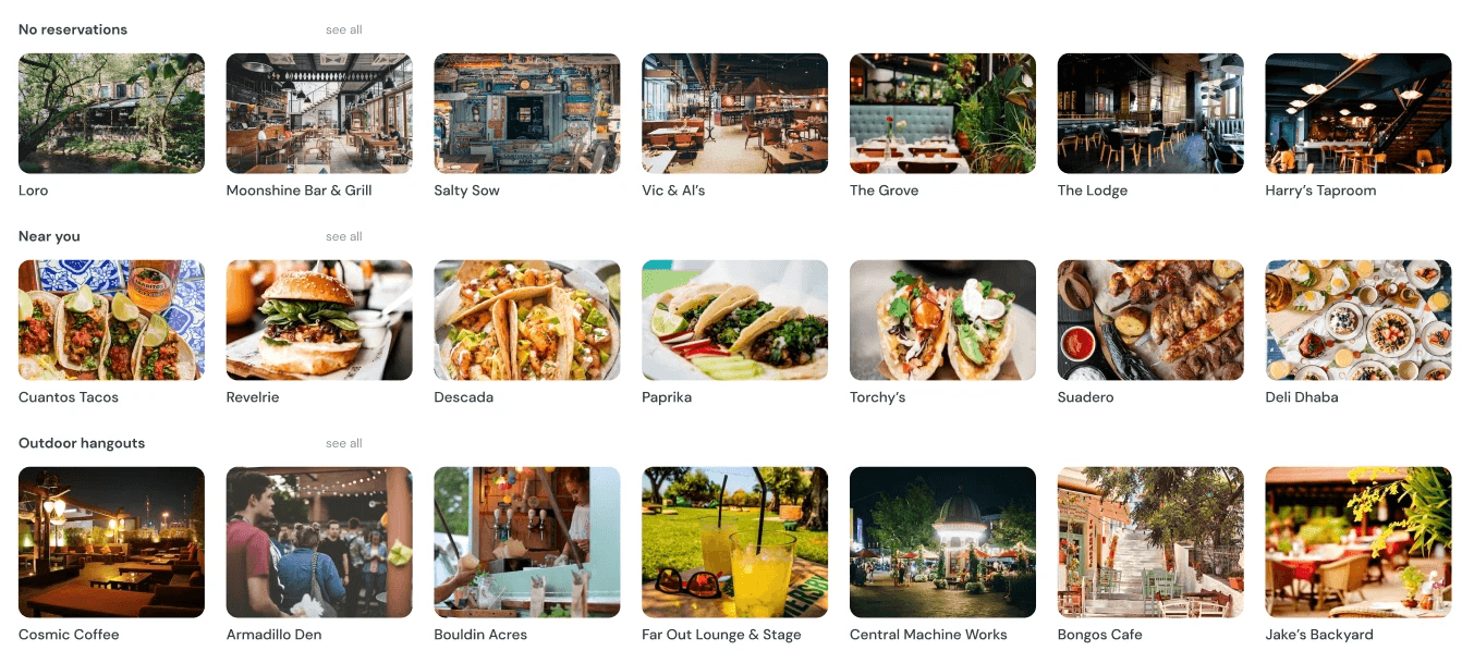
High-fidelity designs focused on clarity and content hierarchy, keeping attention on restaurants rather than interface chrome.

Home prioritizes curated entry points so users can quickly explore or jump straight back into saved lists without re-browsing.

Density and filtering are intentionally restrained to reduce visual noise and help users move from browsing into decision mode.

CHANGE THIS: Detail screens are designed to convert interest into action: save for later, get directions, or share - without forcing commitment.
CHANGE THIS: Detail screens are designed to convert interest into action: save for later, get directions, or share - without forcing commitment.
06 - CORE FEATURE
Saving for later is the product.
Favorites and lists aren’t a secondary feature — they are the retention loop. Saving is lightweight, personal, and reversible, which lowers decision pressure and makes discovery feel safe.

Lists give structure to taste. Users organize places the way they think — taco spots, brunch ideas, out‑of‑town visitors — not by algorithmic categories.
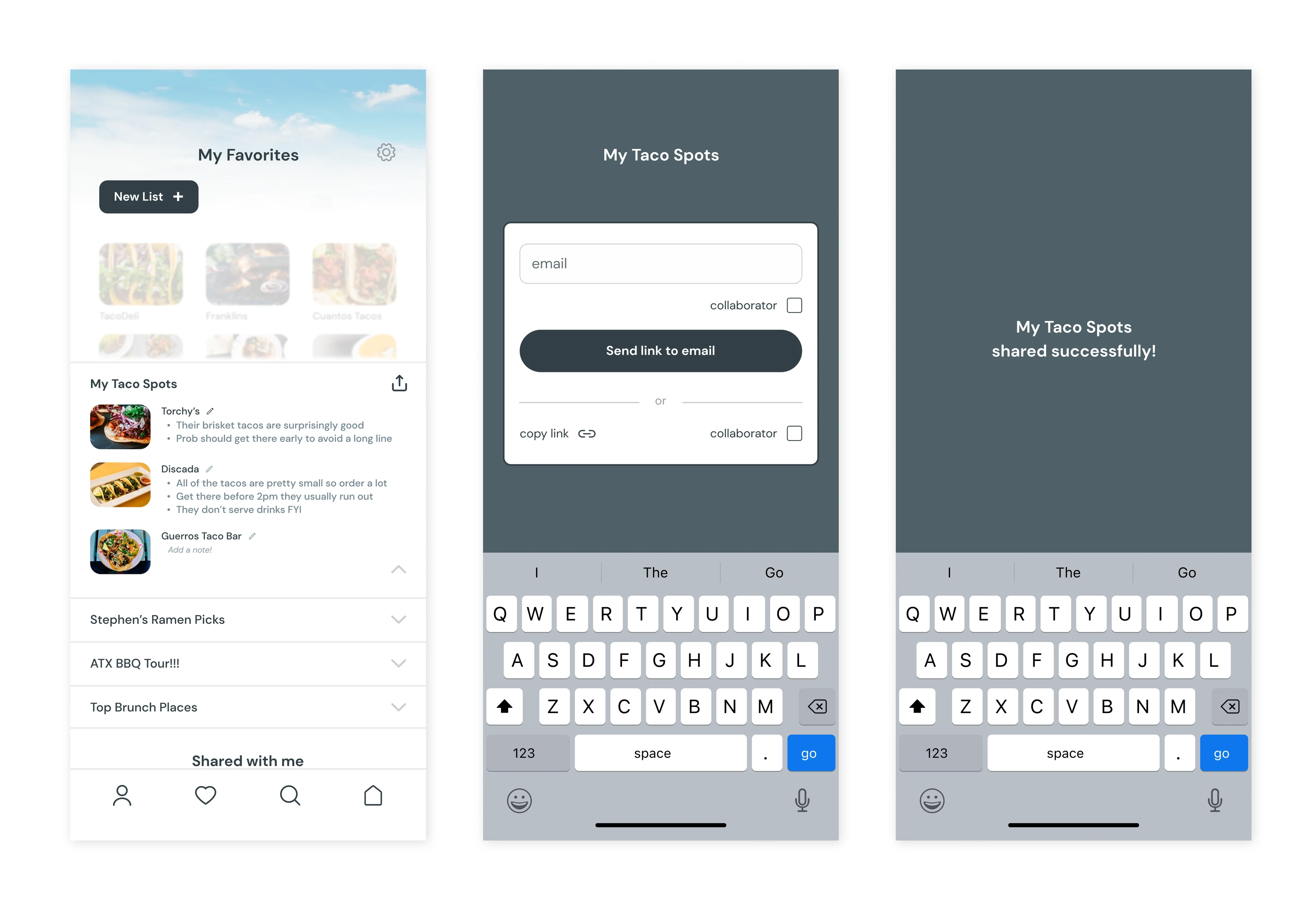
Sharing turns private taste into social signal. Lists become artifacts people send to friends, creating organic growth without ads or feeds.

Saving is intentionally frictionless — a single tap creates future optionality without forcing a decision in the moment.
• Why this matters
Discovery tools optimize for browsing. Foodie ATX optimized for remembering. That shift reframes success from clicks to long‑term relevance.
07 - RESULTS
Real product constraint: ongoing cost.
Foodie ATX didn’t launch due to API costs and lack of a viable revenue path for an ad‑free experience.
What I’d do differently: Validate willingness-to-pay earlier, design a cheaper data strategy (cached data + limited calls), and test list-sharing loops before building full discovery.
If this shipped: Favorites and list sharing would be the primary success metric — measuring retention through return visits and organic sharing rather than raw discovery volume.
Reflections
This project strengthened my product thinking: translating design into buildable scope, negotiating constraints, and using research to justify pivots.
Loops matter: Lists create a reason to return and a reason to share.
Costs are UX: If the model can’t sustain, the experience can’t exist.
Signal over noise: I learned to design for trust instead of “more content.”
Programs used
Figma, Protopie
Timeline
Summer 2023
Role
Designer, Researcher, Prototyper
Austin’s food scene is booming, with new restaurants constantly opening and social media influencers showcasing the latest dining spots. However, discovering and keeping track of great restaurants isn’t as easy as it seems.
• Google and Yelp reviews are unreliable, with most places rated 4.5 stars or higher, making it difficult to differentiate truly great spots.
• Social media is cluttered—while food influencers highlight exciting places, users can only save entire posts, not specific restaurants, leading to disorganized lists that get lost in a sea of saved content.
• There’s no easy way to track personal favorites or get curated recommendations tailored specifically to Austin’s food scene.
Design a food discovery app that provides a more curated, local-first approach to restaurant recommendations.
• Favorites Feature: Users can create custom lists, add notes, share recommendations, and collaborate with friends.
• Curated & Trending Dining Options: A more reliable way to explore top spots in Austin, with recommendations based on location and popularity.
• Chef Profiles: A dedicated section to highlight local chefs, their culinary backgrounds, and the restaurants they’re affiliated with—adding credibility to recommendations.
Research
Method 1: Survey - 100 Respondents, Austin Residents & Frequent Diners
Key Insights:
82% of respondents reported that they have been to restaurants with high Google ratings but found it to be disappointing.
67% said they rely on word-of-mouth recommendations over online reviews due to trust issues.
74% expressed interest in a more localized, curated approach to restaurant recommendations.
45% said they often struggle to decide where to eat due to an overwhelming number of options.
Method 2: User Interviews - 5 Participants, Mix of Foodies & Casual Diners
Common Pain Points:
Review Fatigue: “Everything is 4.5 stars—it’s hard to tell what’s actually good.”
Trust Issues: “I don’t trust Google reviews because they feel inflated or fake.”
Lack of Local Perspective: “I’d rather get recommendations from locals who actually know the food scene.”

Flow Diagram
This flow clarified the moment of intent: people decide before they commit.
Foodie ATX optimizes for save → recall → share, not endless browsing or forced decisions.

Once the flow diagram was established, I started creating the low fidelity wireframes.
These wireframes are from my original design which included an ordering feature. This evolved after conducting user research to focus primarily on the favorite feature.

High-Fidelity Design

Color Palette
The use of images led me to decide to keep the color palette relatively simple.

8pt Grid System
I chose the 8pt grid system because this helps to create visual stability and order, making it easier for users to understand the layout and navigate the design.
Carousels vs Accordions
I explored accordion menus but given that images are paramount when it comes to food, I decided to use carousels for the home page.

Typeface
I chose DM Sans to promote legibility, communicate tone, and sentiment of the brand.

Home Screen
I focused on a minimal home screen with lots of carousels to help cut down on clutter and keep the design simple while utilizing plenty of whitespace.
List Screen
I added a carousel for the images on the Near You page so that users could view additional images without having to leave this page.

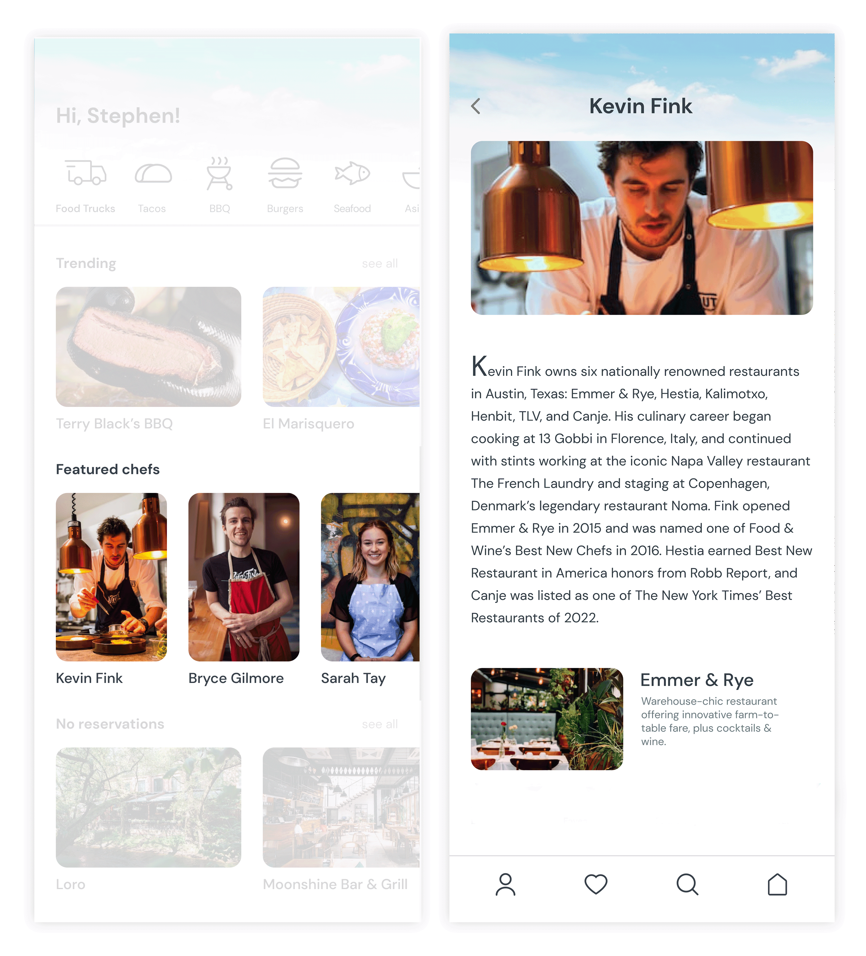
Chefs
Having a section for information on chefs is what helps differentiate Foodie ATX from other apps that only display restaurants or articles.
Favorites Feature
The favorites feature was added after conducting user research. This quickly became the cornerstone feature of Foodie ATX. I expanded further when I decided to allow users to create lists within their favorites. Users can then share their lists and also add collaborators to lists. This is also meant to help organically grow users.
I learned so much about the dev process when building this feature. In working with developers, I gained knowledge about the intricacies of this process as well as the importance of deep linking.

I first used a bookmark icon but decided on a heart because that evokes more of an emotion than a bookmark. Although users can create lists on their favorites page, I decided to add a shortcut to that process as well.

Although I chose carousels for the home screen, accordion menus made more sense for the favorites page. If users don't immediately add something to a folder, it appears in the upper section. Users can long-press one of those unlisted restaurants to drag-and-drop it into a current list if they choose not to create a new one.

