


Reviews
Main Tasks & Challenges
Update UI
Modernize the interface and incorporate a dark mode theme.
Improve UX
Improve the existing features to solve the usability issues.
Add New Features
Reference the reviews of their app to see what users want.

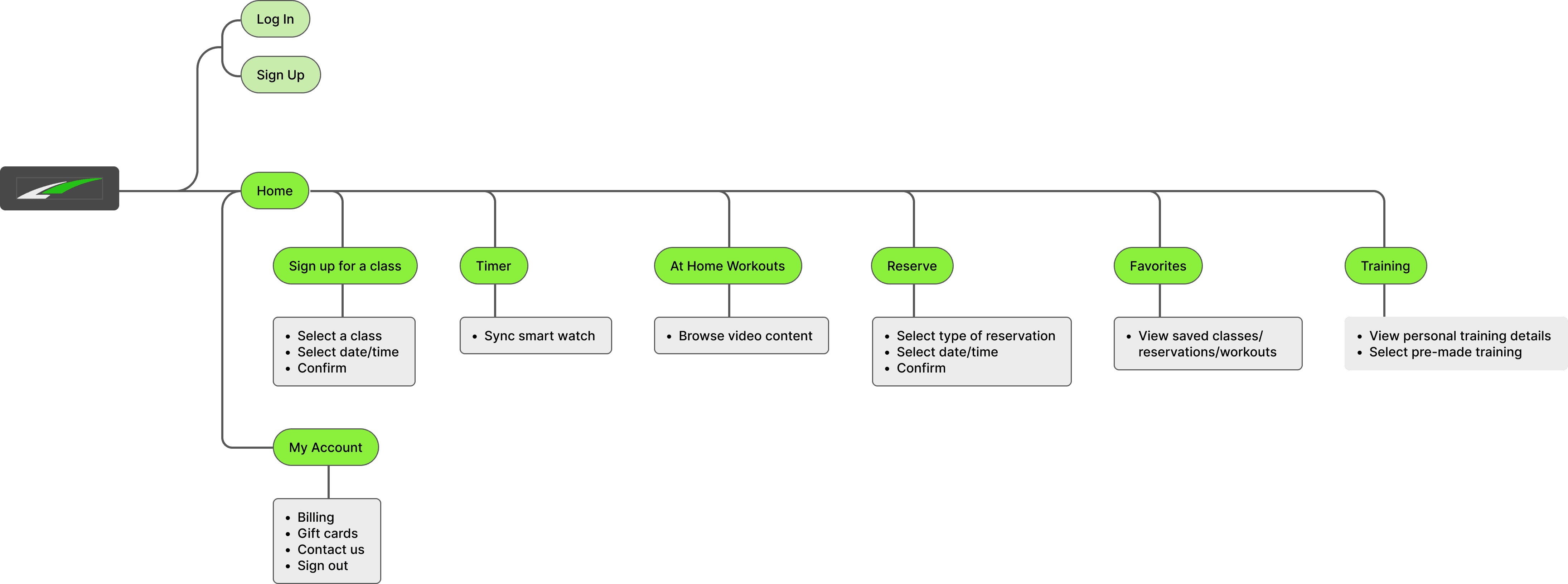
Home Screen
Layout feels very clunky and too many taps needed to arrive at desired screens/information.
QR code to check in should always be visible on this screen.
Color palette feels bland/outdated.
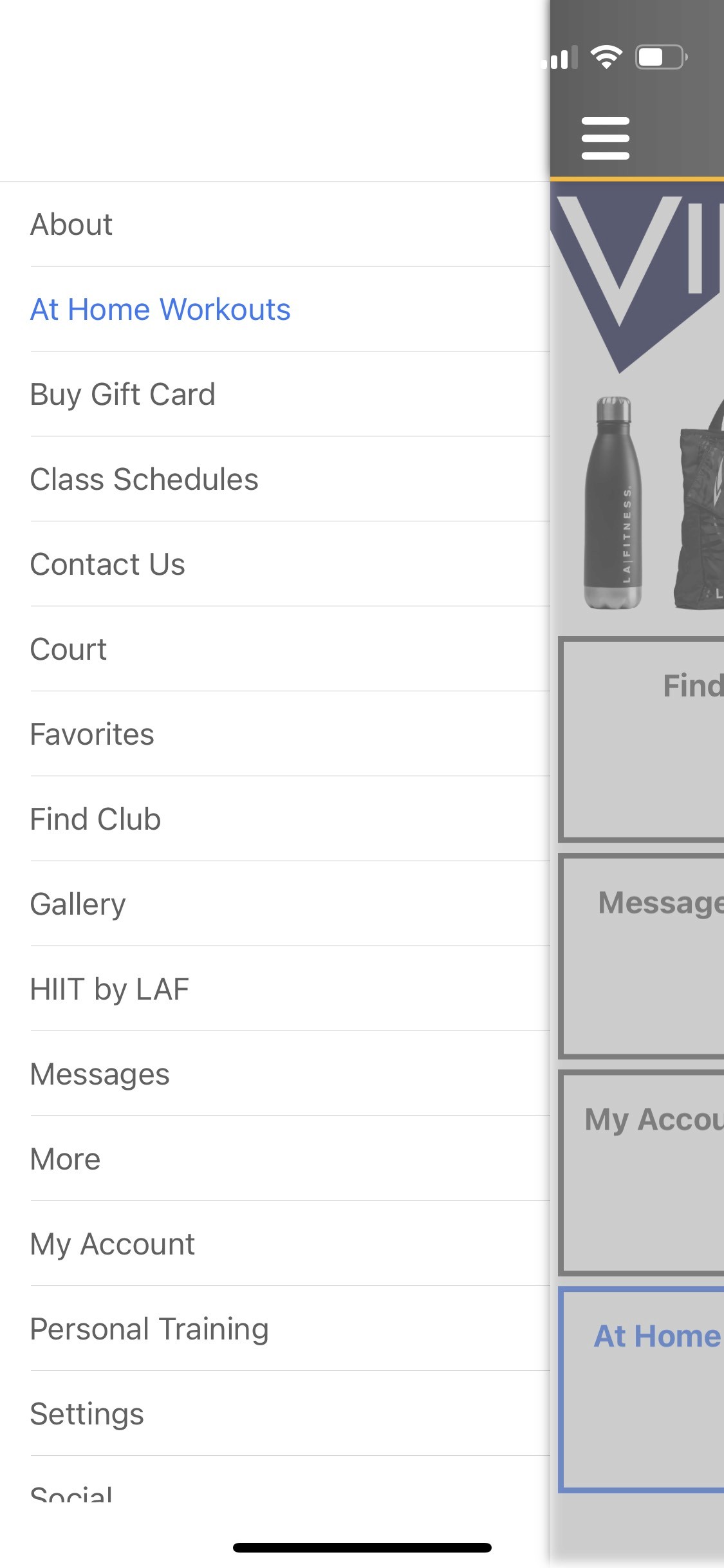
Menu
Way too much information in the hamburger menu.
Several items in this menu are also on the home screen.
Thumb bar may be the best approach. It would improve usability and user satisfaction during navigation.

Find a Club
When signing up for a class or making court reservations, you're always prompted to select a club location.
Being able to set a "Default Club" would result in less taps for users and alleviate some frustration.
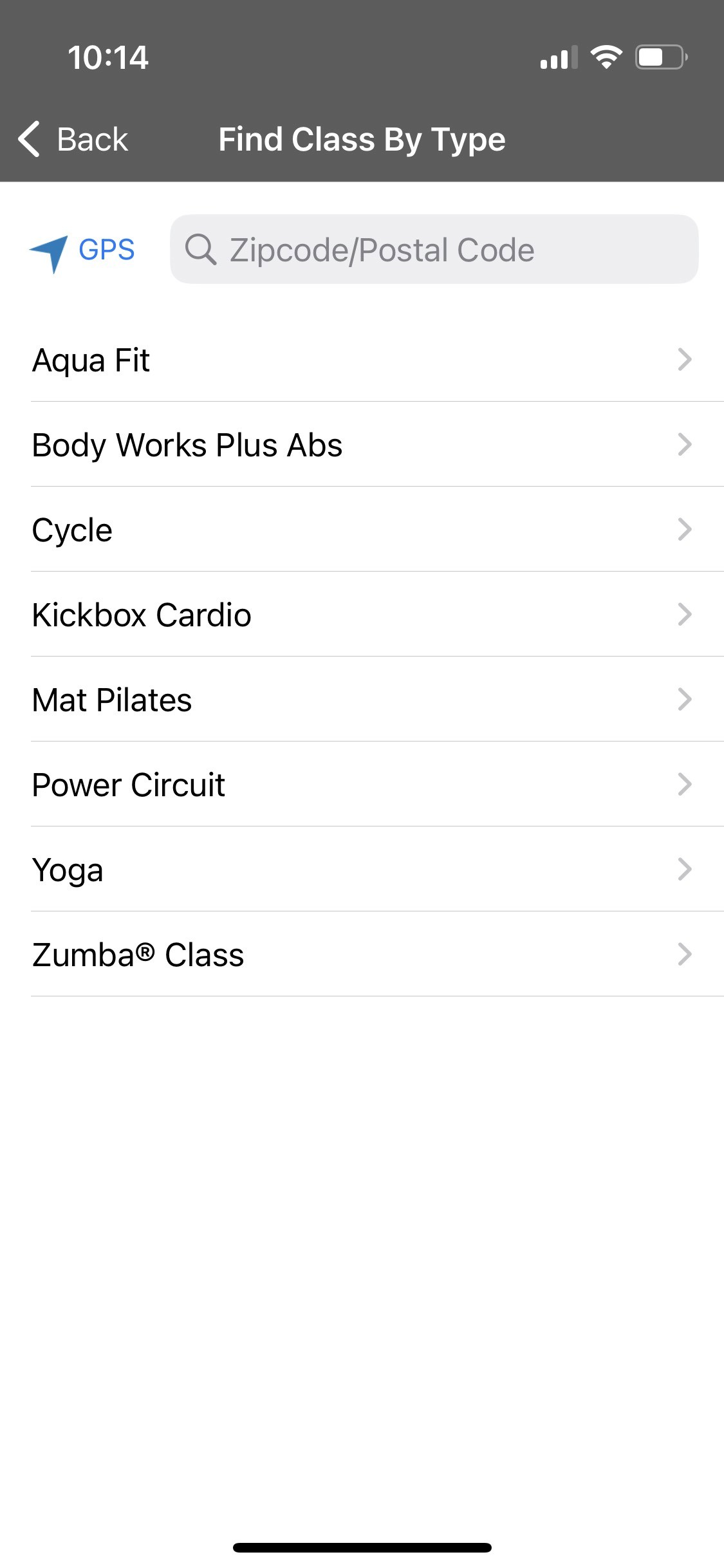
Find a Class
Although this design does "work" it could certainly use a face lift.
Simplified User Flows
Friendly, clean, modern design
Typography
Inter
Icon Set
Lauren
@waller_texas
Honestly the @framer publish time is insanely fast. Just published 2 weeks of changes in 5 seconds – like it’s almost


Manoj
@manojnayak
Websites built on @framer look so beautiful.
Meet the new home screen look
Home Screen
Layout feels very clunky and too many taps needed to arrive at desired screens/information.
QR code to check in should always be visible on this screen.
Color palette feels bland/outdated.
Smartwatch integration